Choosing the correct paint color for a small room can be challenging. For my latest project, I was in charge of a complete overhaul of a two bedroom rental apartment. Previously I had worked on larger spaces, usually homes greater than 3000 sq ft. This latest project begins with a living room for a garden level apartment. The space is in an attached home where there is limited natural light in addition to multiple small rooms. After searching through many many articles on how to deal with small spaces, I decided to opt for anything but white for the wall color choice. And to go with Benjamin Moore paints, since I have used their products in the past with good results. With all of the color options available, I decided to go with gray (the inspiration was from a piece of stoneware from the Tang Dynasty shown in the cover photo) but it had to be a light subtle gray. I did not want my walls to look “dirty” or depressing. I also did not want beige. I hate beige. I hate beige because it feels outdated to me & reminds me of makeup foundation. As far as shades of gray are concerned, beige is an issue. Green undertones are also an issue for me, and I’ve heard that an unattractive green tinge is present in some gray paints (particularly for Benjamin Moore Gray Owl). Before committing to a specific shade, I purchased a few samples from a paint store & tried them on the wall under natural light. I wanted to see how the paint would change in the light & whether it would make the room seem smaller. I also wanted to match it to the trim. For the shades of gray I chose: Stonington Gray, Revere Pewter, Silver Satin and Gray Owl.
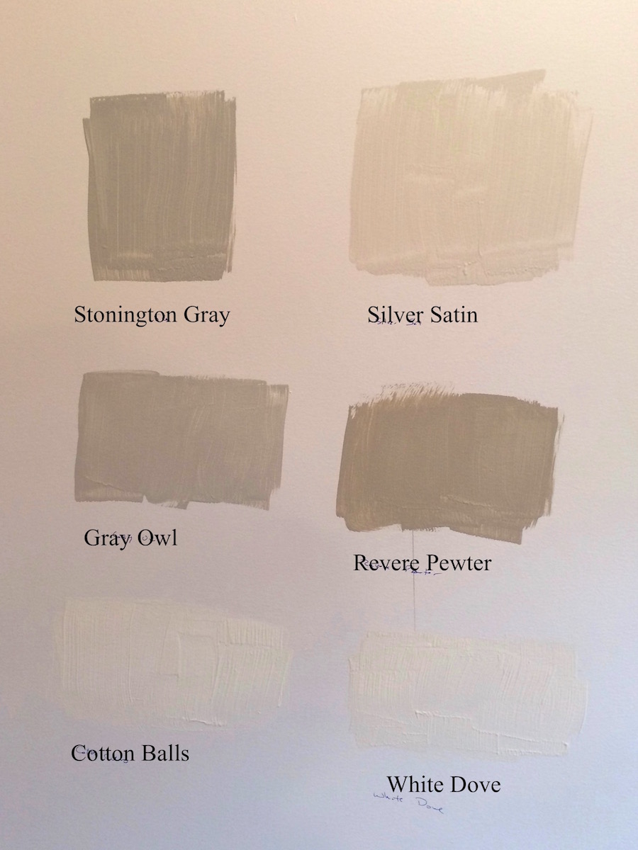
For the trim, I tested Cotton Balls and White Dove. I liked White Dove but thought it was a bit too yellow so I went with Cotton Balls. Cotton Balls seems to be a favorite color for trims and bathrooms where you don’t want to go stark white. I can see why — it’s a beautiful soft white that coordinates well with most colors. As for the shades of gray, Revere Pewter was too beige, Stonington Gray was too dark, Silver Satin was very attractive but made the room feel unremarkable and small, and Gray Owl was close to perfect but not quite there. I returned to the paint store & asked them to lighten the Gray Owl by 50%. The resulting shade was perfect for the room. It’s not too dark but not a dirty gray either. It had the correct amount of warmth without looking beige, green or blue.
Next, I have to choose paint colors for the kitchen and bathrooms. I’m thinking of a subtle warm gold color for the kitchen and maybe a dark blue (like the wall color shown behind the stoneware cup) for the master bath. A good color scheme should be coherent but not too similar, so that when you move from room to room, there is a sense of change creating the illusion of more space. Lighting is key too. In the living room, LED lights with dimmers were installed in the ceiling. Lighting and trim size were reduced to account for the reduced square footage. To be continued…